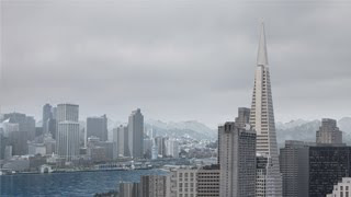
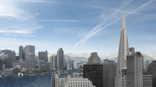
Good job, apply a mask on the fin in the part of the video that is disappearing just before going behind the transamerica.
Thursday, December 3, 2009
Thursday, November 12, 2009
Class 11 Jeff Bedrick
I showed my progress so far:
I need to start no too close to the zeppelin, also why using a mask on the video for the wig, it's easier to have a still image of the boat with the wig and animate that...
Fix the borders on the zeppelin the choker it's eating part of the pixels and start moving the camera from the very beginning until the end, don't stop it.
Thursday, November 5, 2009
Class 10 Jeff Bedrick
This is my work in progress, I've worked only on the zeppelin and the water, the water is a real footage I filmed on the bay.
The feedback Jeff gave me was to put the zeppelin a little more up because at the end it hides behind the Transamerica Building, the camera move it's too sharp, I should make it smoother and play with the layers in after effects to give depth to the pic.
The water is looking good, I don't need to add any kind of animation to the reflects but I still need to make the camera travel from the pic and see little movement on the buildings.
A classmate told me to use something called match choker. Effects>Matte>Match Choker to get rid of the dark border of the object coming from maya.
Cool site to look for pics: http://www.compfight.com/
Thursday, October 22, 2009
Class 8 Jeff Bedrick
I have a final project proposal:
This is kind of what I want to do for my final, I might change the city landscape to do a new one but I want to keep the Transamerica Building.
YUppiiiii!!! he approved my previous landscape, so it's gonna be easy to do!!, I just need to model the zeppelin.. the birds he said they should be smaller and flying horizontally, right now they are distracting, and I should film real water an put it on my scene the same with the estela the boat leaves....
I might also add little movement on the clouds in the back.
I need to cut the hilton building to move it later when I do the zoom out, also ease in and out on the camera move and the starting shot a little more far away so the change before the starting camera and the final one is not that big.
Tips on my scene:
I need to optimized my scene in photoshop, merge layers that are working together, example:
Merge sky as a single layer, merge all mountains into 1 layer, middle ground merge everything but the water and atmosphere in that level and so on...
Thursday, October 15, 2009
Class 7 Jeff Bedrick

This is my final, Jeff gave me some corrections to make but I worked on them during the class.
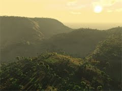
Jeff talked to us about Vue 7 which is amazing to create landscapes, here is an example:

We gotta start thinking about our final project, it should include animation (I'm happy with that because that's my area of expertise haha) but I don't think I have to much time to work int his project...
He gave us a link to a cool tutorial on 3D compositing:
Thursday, October 8, 2009
Class 6 Jeff Bedrick
Thursday, October 1, 2009
Class 5 Jeff Bedrick

This is my proposal for my midterm. Jeff said it is a good start, I have a nice color palette. I need to fix the light direction, the middle ground city gives me that direction, put more contrast in the foreground.. I should think on flipping the foreground city to get a better light direction.
Jeff recommended visit this site: http://www.conceptart.org/
Subscribe to:
Comments (Atom)
